In a moment of optimism and good faith, I visited healthcare.gov one time last December and somehow, foolishly, provided my email address. Like millions of Americans, I soon found myself on the receiving end of a deluge of increasingly apocalyptic messages reminding me the deadline for enrollment was nigh. I never finished setting up an account—so healthcare.gov had no idea whether I even needed marketplace insurance. And yet I received an email. Every. Single. Day.
Instead of inspiring action, frantic and frequent emails tend to cause people to tune out from key messages. In fact, 43% of consumers say that they receive too many commercial emails. But this doesn’t necessarily mean they want to sever ties with the companies, charities, or well-intentioned government bodies that cross the line into spam territory.
I’ve written previously about the importance of the end of a customer’s relationship—after all, you don’t want to leave a bad taste in the mouth of a customer who may return or recommend your brand. But I still see so many companies treating their customers’ pleas for inbox sanity as an abrupt end to that part of the relationship, offering limited or no alternatives to the one-size-fits-all “unsubscribe” option. As a result, they miss valuable opportunities to engage meaningfully on each customer’s terms. The solution, as Harvey Kreiswirth wrote in a post from last summer, is to let your customers opt down instead of opting out.
So what does a meaningful email opt-down experience look like?
First, marketers need to respect customer wishes and empower them to define the experience. Put customers in the driver’s seat by providing options for:
- How they are contacted. Email may be the easiest method of outreach for your company, but it’s not always customers’ preferred mode. That’s why opt-down pages should provide easy transitions to other communication channels—including social media, mobile text alerts, and alternative email addresses.
- When they are contacted. Here’s the critical difference between opting out and opting down: Customers who aren’t a fan of daily emails may well be interested in a weekly or monthly summary. How often is too often? Good old-fashioned analytics will help you understand which types of communications, delivered at which frequency, will be most effective at getting customers to open, read, and engage.
- What they are contacted about. Let customers steer the conversation – if they’re not interested in a generic newsletter, can they still receive personalized alerts or urgent notices?
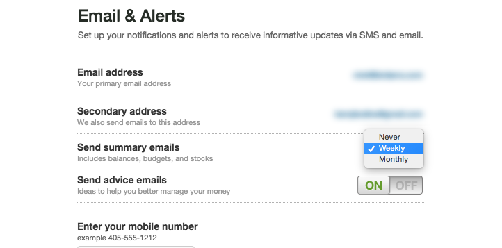
For example, Mint.com offers control at all three levels. Customers are transported to the account page where they can edit their mode of contact, choose from a range of frequency options, and select to receive email on specific topics, like how to better manage their money.
Second, opt-down experiences should not be bland and brandless. To up the chance that customers will remember your company positively and choose to re-engage, design an opt-down experience embraces your brand’s message, tone, and visual guidelines—not the generic style of your third-party newsletter provider.
In this regard, Mint.com falls down a bit. Its email preferences page follows the general style guide used on forms throughout the rest of the site. But it certainly doesn’t take advantage of the strong visuals associated with the company’s recent brand refresh, which make the brand feel fresh and, well, minty!.
Disagree? Don’t hit UNSUBSCRIBE just yet – I’ll provide more detail about in-control, on-brand opt-down experiences in upcoming posts.


