I go to a lot of conferences. A lot. And frankly, I’m sick and tired of all the bad nametag design that I see — even, or I should say especially, at DESIGN conferences. Here the major problems:
- Tiny type. Type sizes that are easy to read on a screen or on a printout that you’re holding can be completely illegible in the common conference scenario of viewing a nametag from several feet away (and often sideways).
- Poor foreground/background contrast. I was at a conference a couple weeks back where my nametag was royal blue with black type. I doubt anyone could read it.
- Poor information design. The most important pieces of information on a nametag are the attendee’s first name, company, and last name. In. that. order. And yet, most nametags neglect to create any sort of typographical hierarchy. As a reminder, we have different type sizes for a reason.
- Confusing status indicators. At the conference where I had the blue nametag, others’ name tags were either yellow or white. And some of the white nametags had red dots on them. What did it all mean?? It felt like there was some secret class system that only the conference organizers knew about.
- An over abundance of logos. The front of the nametags at one design conference I recently attended were half — yes half! — covered in sponsor logos. The extreme clutter made it difficult to focus on any single piece of information.
- One-sided nametags. Every double-sided nametag I’ve seen has the attendee’s name on the front and other information (or nothing) on the back. And yet many lanyards allow for easy nametag flipping throughout the day, causing the attendee’s name to face his/her shirt instead of other attendees’ eyes.
These problems produce a variety of awkward interactions between attendees:
- Our forgetfulness is exposed. Let’s face it: it’s nearly impossible to remember everyone’s name at a conference. And it’s even harder to remember someone who you haven’t seen since last year’s conference. A quick glance of a nametag could conceal the fact that you’re “not good with names,” but the nametag issues above ruthlessly expose you.
- We engage in creepy staring. Small or poorly contrasted text makes us stare, squint, and even bring our heads closer to attendees’ nametags in order to read them. Where are nametags positioned? Usually on attendees’ chests or bellies. And what body parts do most adults NOT want a stranger staring at? Yup, you got it.
- We have nothing to talk about. Nametags could — but 99% of the time don’t — provide any context about attendees other than their names and companies. Wouldn’t it be nice if nametags could shed some light on what we like or what’s important to us? They would become instant icebreakers.
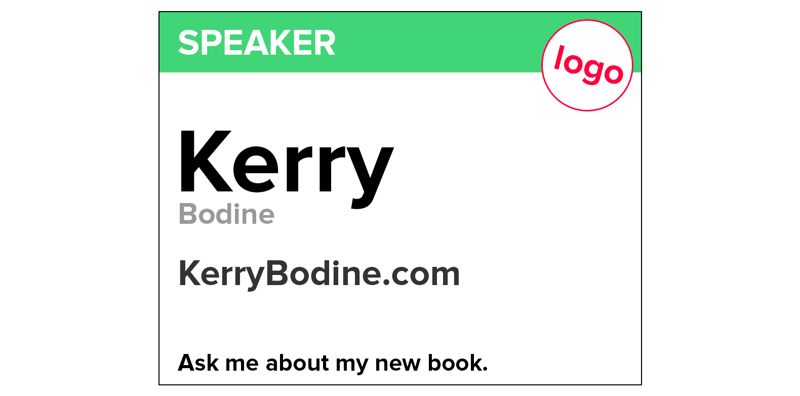
Here’s my recipe for a good conference nametag:
- Make the first name humongous and high contrast. Seriously, make this field as big as will fit across the width of the nametag. Black text on a white background will make for the easiest reading.
- Make the last name small and lower contrast. Do we really need to know everyone’s last names? I think not. If you’re going to connect with other attendees on LinkedIn, you’re probably going to get their business cards anyway. So let’s stop making the last name as visually important as the first name.
- Make the company name medium size and medium contrast. Yes, of course, we need to know where people work — so company name should be bigger than the attendee’s last name. But I’d argue it’s still not as important as the attendee’s first name.
- Make the conference logo unobtrusive. We all know what conference we’re at. We don’t need a giant logo taking up half the nametag.
- Ditch the sponsor logos. We all also know who the sponsors are. Their logos are plastered everywhere we look. So let’s make the attendee nametag just about the attendee, ok?
- Make status indicators simple and clear. Highlight speakers and sponsors with a text-based status indicator that’s printed on the nametag. Yes, I’m instructing you to ditch the little status ribbons that stick to the edge of the plastic nametag sleeve. They end up half falling off and looking ratty by the end of two days — and that doesn’t exactly scream, “I’m important.”
- Add an “Ask me about…” line. With all of the extra space you’ve now got, why not let attendees personalize their nametags with information that will help them have meaningful conversations with others at the conference? It should be easy to add a character-limited text box to your conference registration form.
- Make the nametag double sided. I beg of you: If the nametag has any possibility of flipping around, make the front and the back identical. If you need to give attendees information about wifi access, breakout sessions, lunch location, or anything else, then create an insert.
Nametags are critical for creating a great conference experience. Please put care into designing this important touchpoint.
Can you improve upon my nametag design? PLEASE DO, and then tweet it to @kerrybodine.


