Smartwatch apps don’t have to mirror the functionality of their phone and tablet counterparts to be useful. In fact, apps that try to do it all on a miniscule device with limited input mechanisms end up cluttered, frustrating, and forgotten.
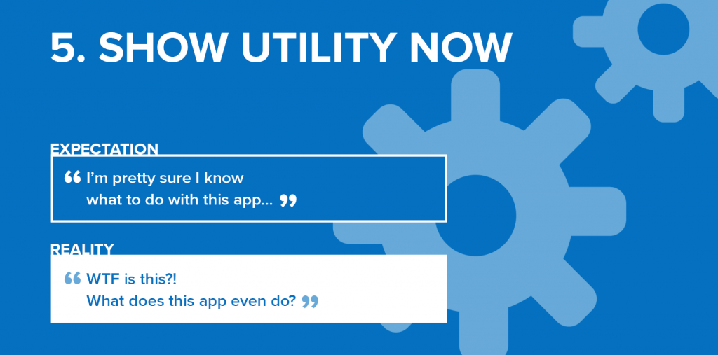
Unfortunately for brands, user expectations don’t automatically align with device constraints. When we partnered with AnswerLab to study how people use (and want to use) smartwatches, we diagnosed a serious case of app apathy. Why? Study participants tended to give smartwatch apps one chance and one chance only—if they couldn’t immediately figure out the app’s purpose, they were unlikely to check back in the future for additional features.
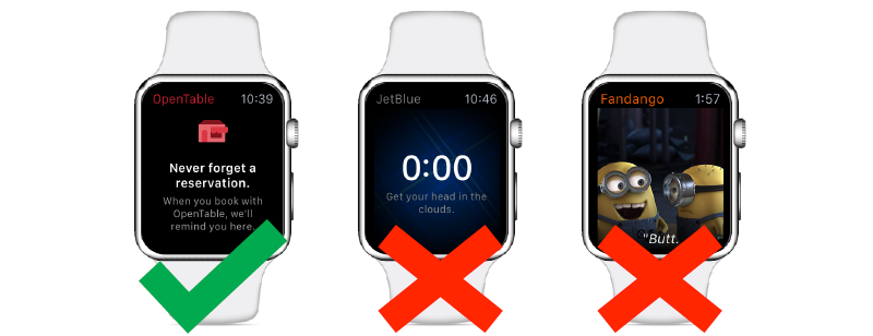
What works: The home screen of OpenTable’s smartwatch app makes a very specific promise: users can expect a reminder of existing restaurant reservations on their wrist.
What doesn’t: JetBlue’s app provides no guidance on what makes it useful. Will it kick into gear after users book a flight or not until they check in? Can it display a boarding pass or make onboard purchases? There’s no way to tell, and the countdown clock feels…ominous.
What really doesn’t: If a user doesn’t already have a ticket for an upcoming movie, the Fandango app spews movie screenshots unrelated to user preferences. During our testing we saw several quotes from the decade-old off-kilter comedy Napoleon Dynamite, as well as this gem from Despicable Me.
If your smartwatch app provides its full value in all contexts and locations, great! But if it’s only relevant in certain circumstances, you’ll need to show utility now by communicating on the home screen just when and how your app becomes indispensable…or users will forget about it altogether.
***
Of course, before you can show your app’s utility, you’ll need to build a useful app! Download your FREE copy of Smartwatch Apps That Work: 5 Value Drivers To Make Your App Indispensable.
