Note #1 — I’m posting this now because:
- It’s timely to the launch of Amazon’s new show Making the Cut, which premiered on March 27, 2020.
- It will be, I hope, a helpful reference for people designing integrated TV + shopping experiences in the future.
- It gave my brain something to focus on other than the coronavirus — and maybe you’re looking for such a distraction, too.
If you’re not into reading something that’s seemingly trivial in the grand scheme of what we’re all dealing with right now, please feel free to come back to this post at a later date.
Note #2 — Spoiler alert! Lesson 4 below includes screenshots of the Episode 1 winning look.
***
I have an admission: Project Runway — the reality show in which aspiring fashion designers compete for big prizes that will help them launch their lines — has been one of my guilty pleasures since its debut in 2004. And I’m a huge fan of supermodel Heidi Klum and Tim Gunn, former fashion chair at Parsons The New School for Design, who co-hosted the show up until 2017.
This past Friday, Heidi and Tim reunited in the Amazon original Making The Cut, which taps into the same basic formula as Project Runway — but with a Jeff Bezos budget.
Having been locked in my house for the past several weeks, I’ve been counting down the days to the series premier. The show itself satisfied all of my reality TV expectations. But what I was especially excited to see is how Amazon would leverage one of the key prizes for each episode’s winners: Having their designs sold on Amazon.com immediately after each episode’s release.
In normal times, it would be a brilliant move for company that owns both mass media production and the world’s biggest online store. But as luck would have it, this integrated business model is playing itself out just as throngs of viewers are out of work (or reeling in their spending) AND Amazon’s normal one- to two-day Prime delivery windows have increased to a month (or longer) for non-essential items (like high fashion).
There’s not much that Amazon can do about the coronavirus or the resulting strain on its supply chain. But what Amazon clearly has control of is the experience that Making The Cut viewers had as they picked up their phones from the couch and tried to look for (and maybe even purchase) one of the winning looks.
Unfortunately, the company that’s known for the precision of its product positioning botched the transition from viewing to shopping. Here are three ways Amazon went wrong.
1) Ineffective Search
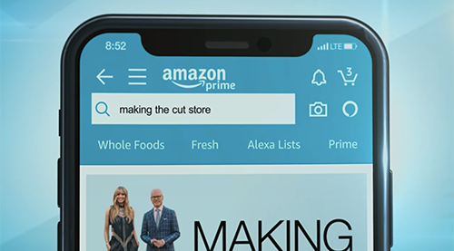 Throughout the show, the image of a mobile phone adapazarı escort
appears on screen while the words “making the cut store” appear in the Amazon search bar. This is a great way to prime viewers for going to Amazon once the winning looks are announced. (Yes, pun intended.)
Here’s the problem. If you’re not paying attention to the exact sequence of words on the screen — like I wasn’t — you’re gonna have one helluva time finding the clothes you want to buy.
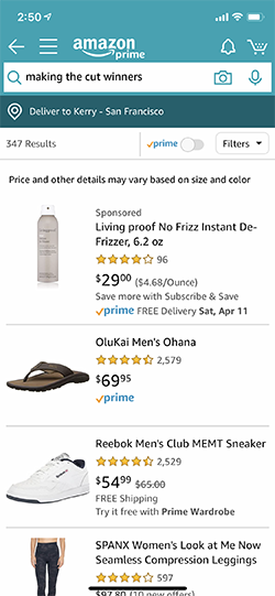 If you type the name of the show — “making the cut” — into Amazon’s search, the first and second results are Episodes 1 and 2, which were released on the same date. The third result, fittingly for the time, is the History channel reality show Alone. No clothing is anywhere in sight.
Adding additional words to the search query doesn’t help much. A search for “making the cut fashion” also brings up Episode 1 — while “making the cut winners” gives me some hair de-frizzer and men’s flip flops, and “making the cut clothing” returns a whole bunch of athletic socks. Hrm.
And, if you somehow realized that you needed to include the word “store,” but simply put it in the wrong sequence (as in “store making the cut”), the first search result is the Mary Burton novel Cut and Run, and the second is a paper scrapbooking stencil. The fifth result is the TikTok app. What?!
2) Non-obvious Paths To Purchase
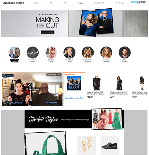 If you do as instructed and type “making the cut store” into sakarya escort bayan
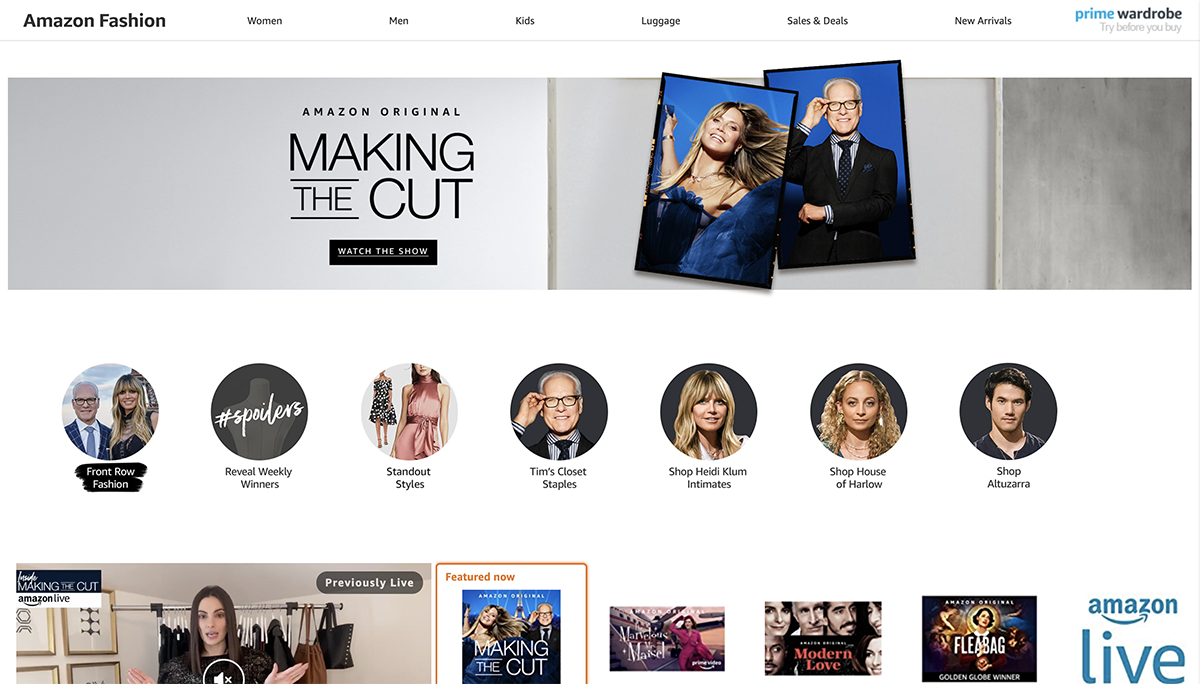
the Amazon search box, you’re rewarded with a reasonably nice-looking landing page full of pictures of seemingly random clothing and accessories, links to collections from Heidi and some of the other judges, and ads for other Amazon programming.
What’s missing? The winning items.
I understand that Amazon didn’t want to immediately reveal the winners to viewers who might not have watched the latest episodes — but I could only find one link to the winning items, and it was through a small gray circle at the top of the page labeled “Reveal Weekly Winners #spoilers.” (See the image at the top of the post.) The icon’s design doesn’t make it easily recognizable as the menu option it is, and it’s easily overlooked amidst a sea of more colorful images.
It’s almost as if Amazon’s digital designers had no leeway to sakarya escort
break (or even bend) the mammoth site’s standard product page templates — even when promoting products that Amazon itself had invested millions of dollars in developing.
3) Unoptimized Mobile Experience
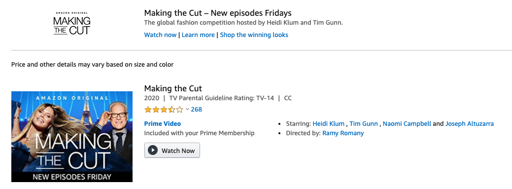
When I search for “making the cut” on my laptop, I see a teensy tiny ad of sorts at the top of the search results, along with the equally tiny and easy to miss links: “Watch now | Learn more | Shop the winning looks.” It’s the type of banner that users have been conditioned, through decades of banner ad advertising, to overlook.
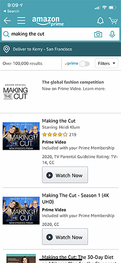 But the mobile experience is even worse: It displays the ad, but without the blue links. As it turns out, the logo and the black text in the ad are clickable. But potential shoppers should not be expected to click blindly on links that do not look like links. This is web/mobile site design 101.
While an unoptimized mobile experience isn’t great in any situation, it’s especially problematic when Amazon’s obvious business objective was to immediately turn the show’s viewers into shoppers. While some viewers may, in fact, have their laptops nearby as they’re watching the show, I’m guessing that for the vast majority, it’s their phones that are surgically attached to their bodies — or at least sakarya escort bayan
directly next to them on the couch.
Overlooking the mobile search experience shows a complete lack of understanding for the context and habits of today’s TV watchers.
4) Too Many Taps
Even if a mobile user stumbles across the link that doesn’t look like a link, it takes an additional three taps to reach a project page from the search results. That’s four taps total, which is simply too many — especially when revenue is on the line. By my count, Amazon could have easily removed two of these pages from the purchase path.
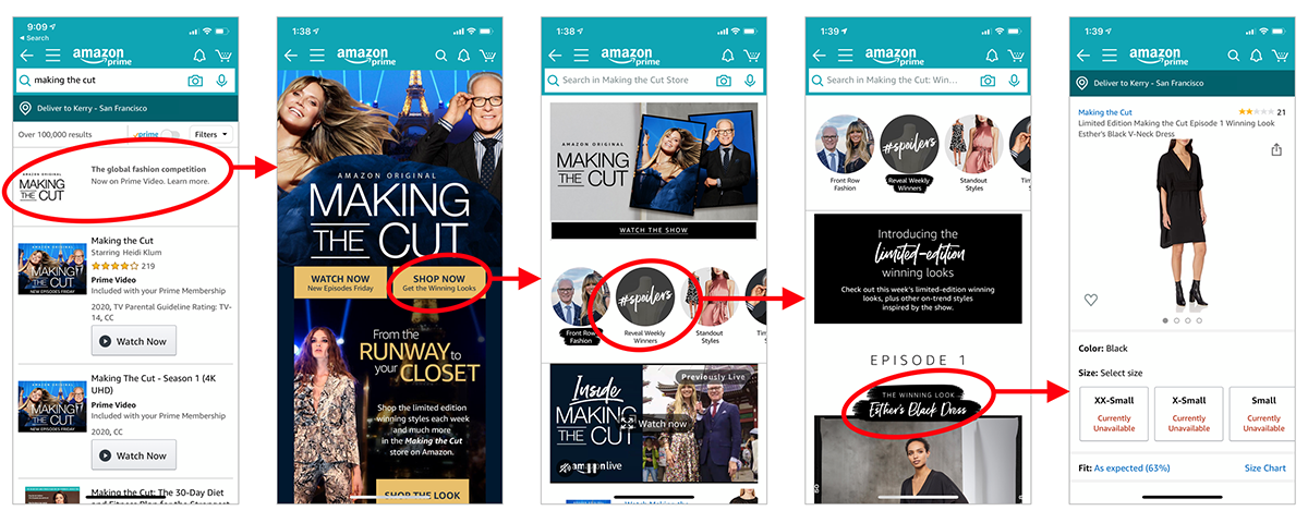
“Let’s make customers work hard to give us money…” said no retailer ever.
It’s not as though some third-party production company sprang the integration idea on them last month, and they had to scramble to put it together in the midst of an emerging pandemic. Amazon Studios filmed the show in the summer of 2019 and had to be in planning mode long before that.
So, I find it surprising that Amazon — with its deep pockets and digital design prowess — left such gaping holes in this experience. They spent scads of money whisking the show’s contestants to far flung locales like Paris and Tokyo. Why skimp on the user interface design and search optimization?
TV + shopping integrations can work — even in the face of a global pandemic. The fact that Amazon is already sold out of the winning Episode 1 item in every size is proof.
But lasting success for the integrated viewing + shopping format will require a greater understanding of how people actually watch TV. Not just what they watch or for how long — but where they watch, with whom, and why. And of course, what devices they’ve got in their hands at the time.
